5 Simple Steps to Improving Your Photos

Lightroom Tutorial

Picture of Hayley Butler

Hayley Butler

Adobe Lightroom is one of my favourite tools for quickly improving the look of my photographs. As it’s name suggests, Lightroom can easily help you to adjust the tone, colouring and lighting of your image. I recommend using it alongside Photoshop for the ultimate photo editing experience. 

Today we’ll be going through some of the Lightroom basics for beginners and 5 simple steps to improve your pictures quickly. Make sure to watch our video tutorial for a complete rundown of this tutorial. You can follow along by downloading the sample image at the end of this article and testing these editing techniques out for yourself!

Importing Photos

First thing’s first, you’ve got to get your photo into the program. In this tutorial we’ll be using Lightroom CC. 

Click the (+) in the top left corner to select the photo you’ll be editing. 

Remember, you need a good foundation to build upon when it comes to editing photos. If you’re working with a low-quality, poorly shot image, there’s only so much you can do to improve it. 

Step 1: Lighting

In this particular image, I don’t like exposure of the mountain in the background. It’s slightly overexposed for my personal preference. 

I’ll drag down the exposure bar until I’m happy with the way it looks. In this particular example, I brought it down to (-1.40)

The exposure bar controls the overall darkness and lightness of the image. As with photography/film, the higher exposed an image, the more information is lost. 

Lighting (continued)

I typically like to flatten out my image as much as possible before adjusting the curves. It gives me the most amount of manipulation over how I’d like the final product to look. 

To do this, bring down the highlights and whites and bring up the shadows and blacks. 

Depending on how dark the darkest parts of your image are, you may have to bring the shadows up quite significantly and vice versa. 

Step 2: Curves

The tone curves can be used to adjust the overall contrast of your image. You can also use this tool to adjust RGB by selecting each colour at the top of the graph. 

In this example, I’ll use the tone curve for contrast purposes. Clicking on the line in the centre of the graph, you can maneuver each point and create new ones. To lighten, bring a point towards the top. To darken, bring a point towards the bottom.

Nice clean contrast has a point at both the top and bottom to create a gentle S-curve. You can see that mine is incredibly subtle in this image.

Step 3: Colour

My favourite step! Here’s where you can change the temperature of your photo to white balance it correctly (or to your liking).

Remember to tweak your overall image saturation and vibrance at the top of your Colour Panel. 

You can also manipulate individual colours in the photo. This step is totally dictated by personal preference. However, we’ll go over some simple ways to work with colour.

What Colour is What?

A big tip I have for beginners when working with the Colour Mixer tool is to carefully identify what colour they’re working with. 

Oftentimes our eyes might see green trees, but they’re actually comprised mostly of yellow. It’s best to always trust your tools when it comes to colour. 

To accurately identify each colour, I recommend using the saturation bar to completely remove that colour from the image. You can see in this example, the top half of the image is almost entirely blue. But the water is blue and teal. 

Changing the Hue

As a dramatic demonstration of hue, you can see what changing the hue does to our blue colour selection. It makes all the blue areas teal.

I like to use this tool in moderation for stylized images or for creating a particular tone. Play around with it and see what works for you. 

Typically, I make all my greens slightly more yellow and all my blues slightly more teal. It’s all about preference. 

Step 4: Effects & Detail

Now let’s take a look at the Effects Panel and Detail Panel. Here you can adjust more overall elements of your photo (ie. texture, clarity and sharpening). I always recommend using every tool subtly so everything blends naturally.  

The clarity tool is something I normally use to bump up the overall punch of the image. In this particular sample, I also added a slight dark vignette around the edges. The grain tool can also be a neat way to make images look as if they were shot on film.

Detail (continued)

When shooting in low light (or on a more unprofessional camera), you may notice some digital noise on the image. These little static dots may become more noticeable when zoomed in. 

The noise-reduction tool is what you’ll need to improve this. It smooths out the pixels to null the effect of noise. But be wary, if you overdo it, the image may become muddy. You don’t want that either. 

Step 5: Linear Gradient

We’ll be going into much greater depth with this tool in the future. However, I still wanted to draw your attention to it. Similar to a mask in Photoshop, there are tools in Lightroom that allow you to change the lighting of select parts of the image. 

In this example, let’s choose the Gradient icon from the right hand side of the program. With the gradient icon selected, draw your gradient onto the image. I put mine on the bottom so I could lighten the water without affecting the image elsewhere. Now you can adjust the lighting toolbars for that section. 

Exporting!

To save your image as a JPG or whatever file type you require, we must export the final product. 

To do this, select File > Export. 

Now make your final dimension and quality selections and hit ‘Export’! 

Before

After

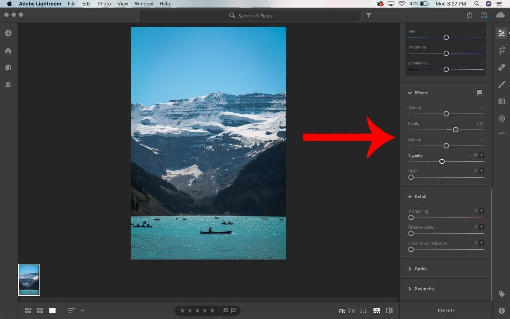
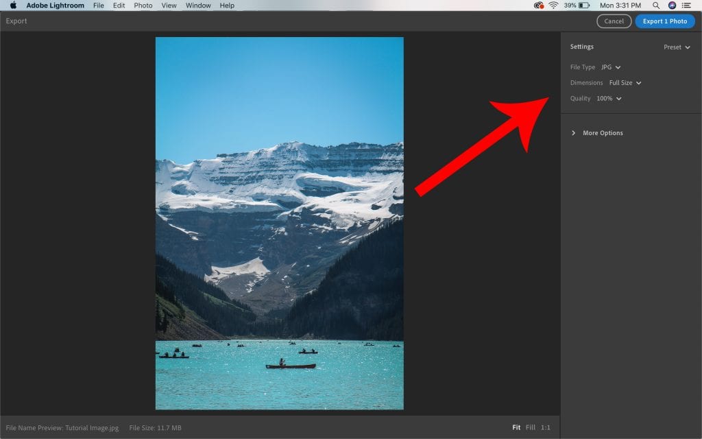
As you can see, in these 5 simple steps, you can easily and quickly improve just about any photo in Lightroom. Don’t be afraid to make mistakes and explore different tools to find your favourite way of working. Above all, let your creativity flow and have fun!

If you decide to try out this tutorial, tag us on Instagram, Twitter or Facebook so we can check out your work! 

Scroll to Top